OLÉA - WEB DESIGN FOR A SKINCARE BRAND
OLÉA
Year
2026
Self-initiated concept exploring premium e-commerce design for the beauty space.
Scope of Work
Overview
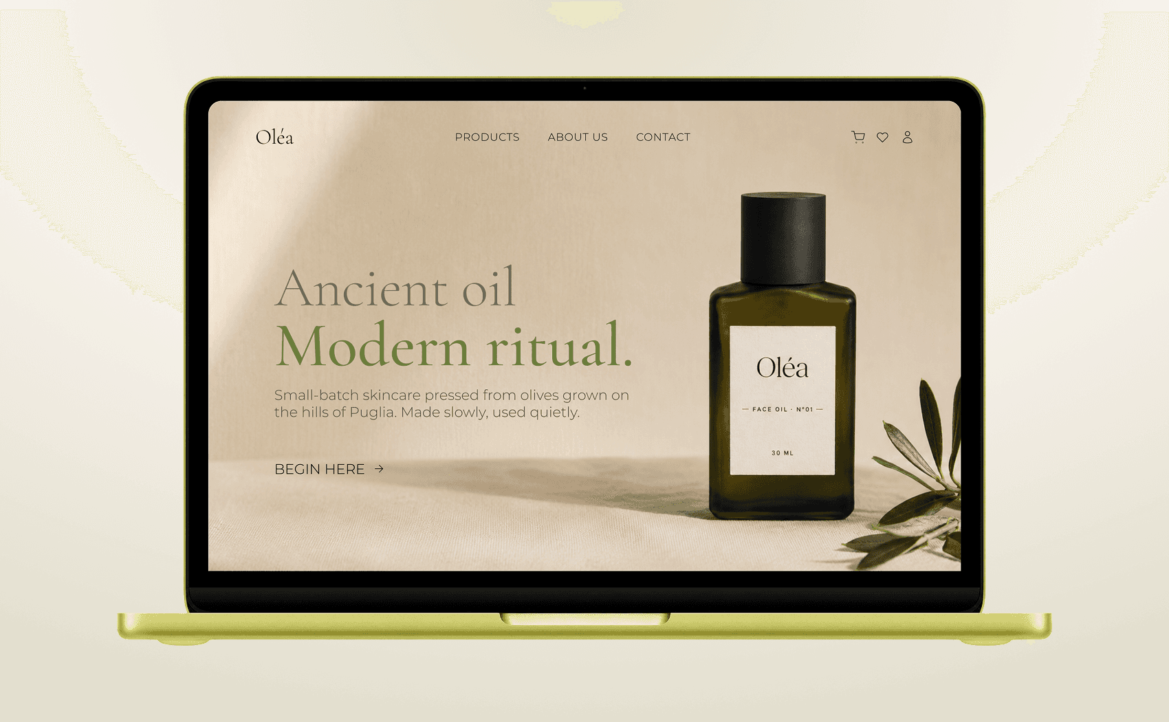
Oléa is a fictional Mediterranean skincare brand built as a portfolio piece to demonstrate end-to-end brand and web design for the e-commerce space. The brief I set myself: create a brand that feels genuinely premium without defaulting to the cold minimalism that dominates the skincare category; something rooted in warmth, ritual and the unhurried beauty of the Mediterranean.
The result is a website that balances editorial restraint with sensory richness.
The Challenge
The skincare e-commerce landscape is overcrowded with brands that look identical: stark white backgrounds, clinical typography and photography that could belong to any product.
The challenge was to carve out a distinct visual identity that communicates quality and heritage without feeling old or inaccessible.
Brand Identity
The brand identity was built around a single tension: antiquity meeting modernity. Every decision was made to hold that tension without resolving it too neatly.
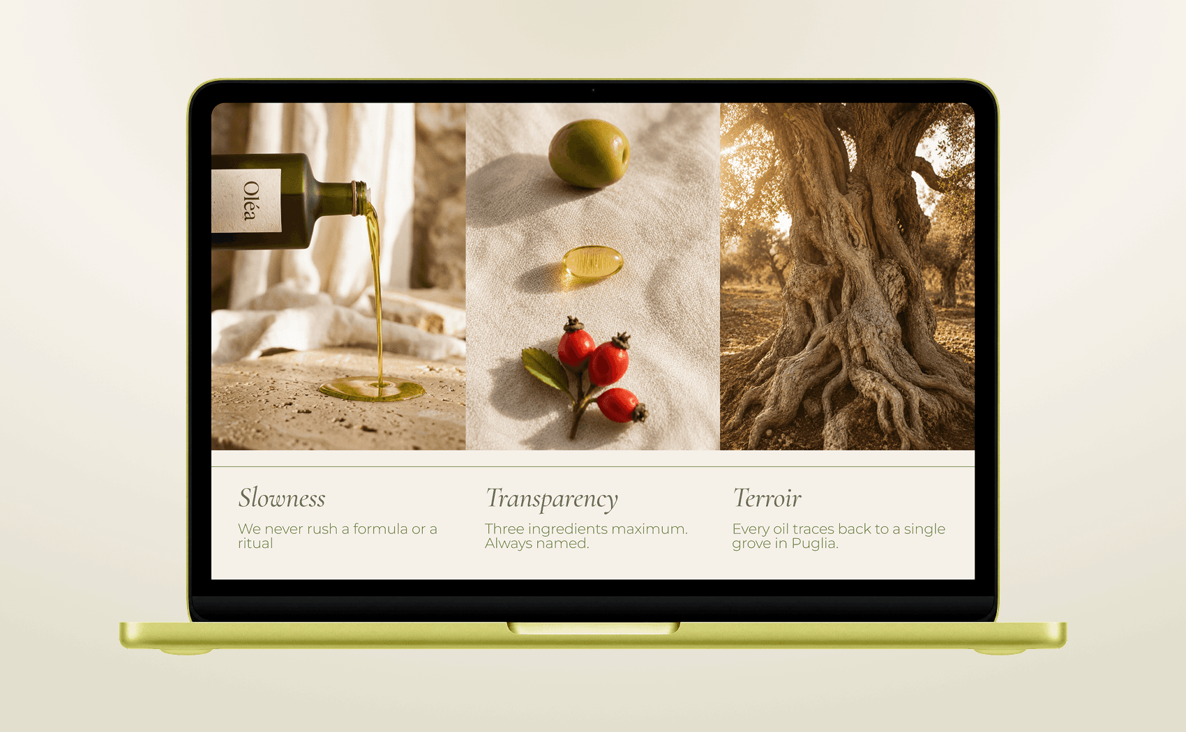
The palette draws directly from the Mediterranean landscape: sun-bleached linen, dry stone walls, terracotta shade, the deep green of an olive grove at dusk. Warm and earthy, but never muddy.
The brand voice is calm, intentional & sensory. The copy never shouts, it invites. The headline "Ancient oil. Modern ritual." sets the tone: short, grounded and just slightly poetic. Every line of copy was written to feel like it was said quietly, not announced.
Design Decisions
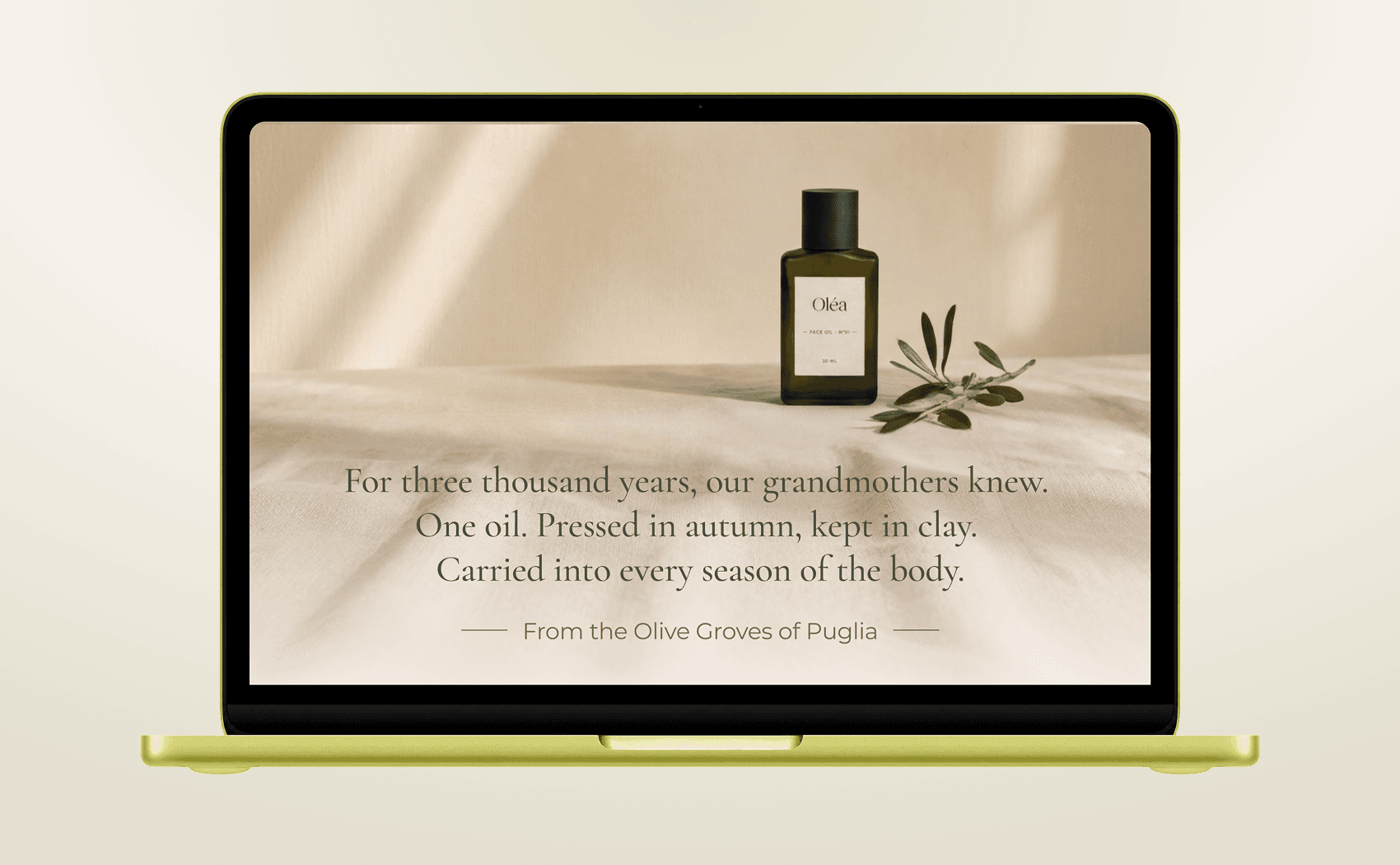
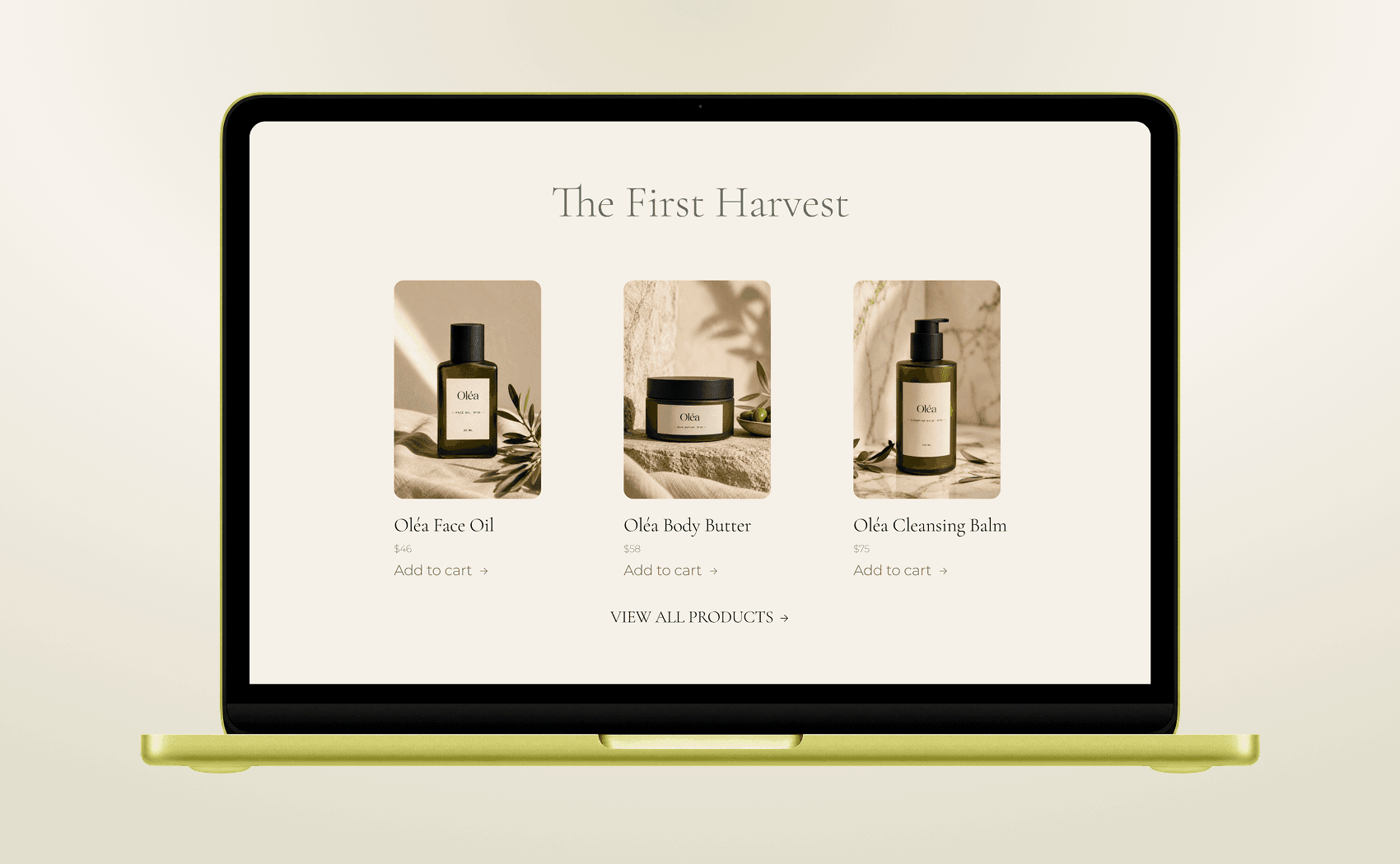
Manifesto before product. Most e-commerce homepages go straight for the shop. Putting the manifesto section second was a deliberate choice: it slows the scroll just enough to let the brand land before the user evaluates the product. It builds trust through tone before price.
Restraint in colour application. Deep olive is used sparingly: for CTAs and key accents. The majority of the page breathes in off-white and linen, which gives every moment of dark colour real visual weight.
Typography as hierarchy. Cormorant Garamond only appears in headlines and the manifesto — moments where the brand wants you to slow down. Everything functional (navigation, labels, body) uses DM Sans. This creates a clear rhythm: serif = feel, sans = do.