ROADWAY - AI Powered Travel Planning App
ROADWAY
Year
2025
From "I want to travel" to a clear, personalized itinerary - without the blank-page frustration.
Roadway combines curated trips ideas with AI-driven editing, so travelrs can shape routes, activities, pace and budget in a simple, guided way. End-to-end UX/UI project designed solo in4 weeks.
Scope of Work

Problem and Solution
AI chat planners expect users to already know what to ask.
Traditional apps offer structure but zero inspiration. Users end up stuck before they even start planning.
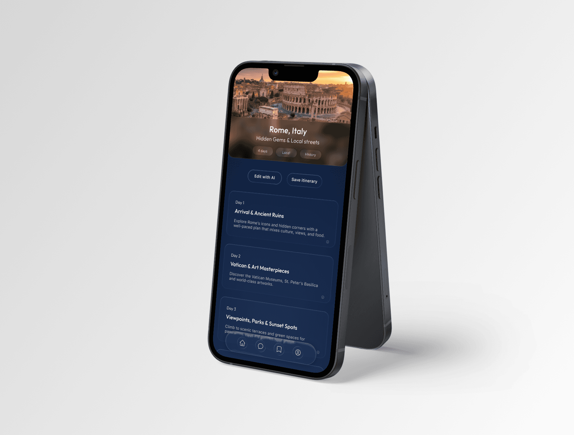
People don't want to open a blank chat. They want to see a real trip idea first, then make it they own.
The solution is a hybrid model where curated itineraries are the entry point and AI acts as a co-pilot personalization. Browse first. Edit fast. No endless back-and-forth.
Research & Insight
Rather than just listing feature requests, I focused on how users describe their frustrations in reviews of AI travel tools and traditional apps like TripIt or Google Trips.
3 clear patterns emerged:
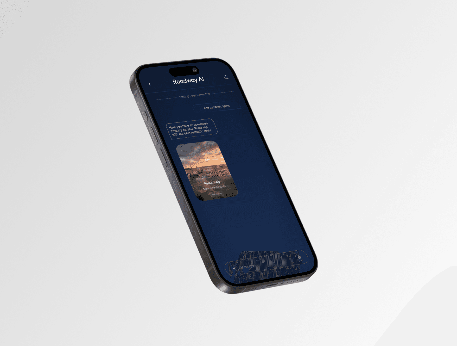
People do not know what to ask AI: prompts return vague results. Users lose confidence quickly and abandon the tool.
Chat-based planning is exhausting: users repeat themselves across messages, then copy everything into a separate doc just to have a readable plan.
Concrete examples unlock imagination: seeing a real route or themed itinerary helps users picture themselves traveling; inspiration has to come before personalization, not after.

Personas & Design Implications
Alex, 25 - Solo traveler: travels often but short trips. Hates starting from scratch. Needs curated ideas he can customize fast.
Vanessa & Marco, 35 - couple: plan longer vacations together but waste time negotiating and reorganizing. Need a structured plan that's easy to align on and adjust without starting over.
Results
Eliminated blank-page anxiety through curated entry points
Reduced planning time by making editing faster than generating
Built trust in AI by keeping users in control of an existing plan
Created a single space where inspiration, structure and personalization coexist
The final experience feels guided, flexible and tailored, without ever feeling overwhelming.
Reflection
What worked: curated starting points lowered friction. Editing over generating improved trust. Clear structure made planning feel actionable.
What I'd push further: collaborative planning for couples, granular AI controls through sliders instead of prompts and export of the itinerary.
Key learning: AI delivers the most value when it supports human decision-making instead of replacing it. Good UX around AI is about structure, clarity and control, not conversation.

